
I thought our old site was custom. Looking back, it was pretty much an AI template with our logo, colors and some photos swapped in. It looked decent enough, but that was really it. Customers still had to leave the site to book and I couldn't manage much myself. The difference now is that it actually feels like something built around our shop.
Owners notice the difference.
This one hurt a little because we spend a lot on Instagram and Facebook. I saw what our landing experience looked like on an actual phone and immediately understood why people were dropping off. We were paying to get somebody interested and then sending them into a clunky mobile experience. It's night and day now.
Our receptionist deserves most of the credit for putting up with the old intake process. She would spend time talking to someone only to find out they were in another state, needed a completely different area of law, or hadn't provided enough information to evaluate anything. Much more of that gets sorted before it reaches her now.
I paid for what I thought was a custom site. Then I started seeing other contractors online with almost the exact same thing. Same sections, same layout, same everything with different colors. That annoyed me more than it probably should have. I wanted the next one built around our actual jobs and our process, not around a theme somebody bought.
Real businesses. Work you can open.
These are live concepts, not slides. Open any build and judge it for yourself.
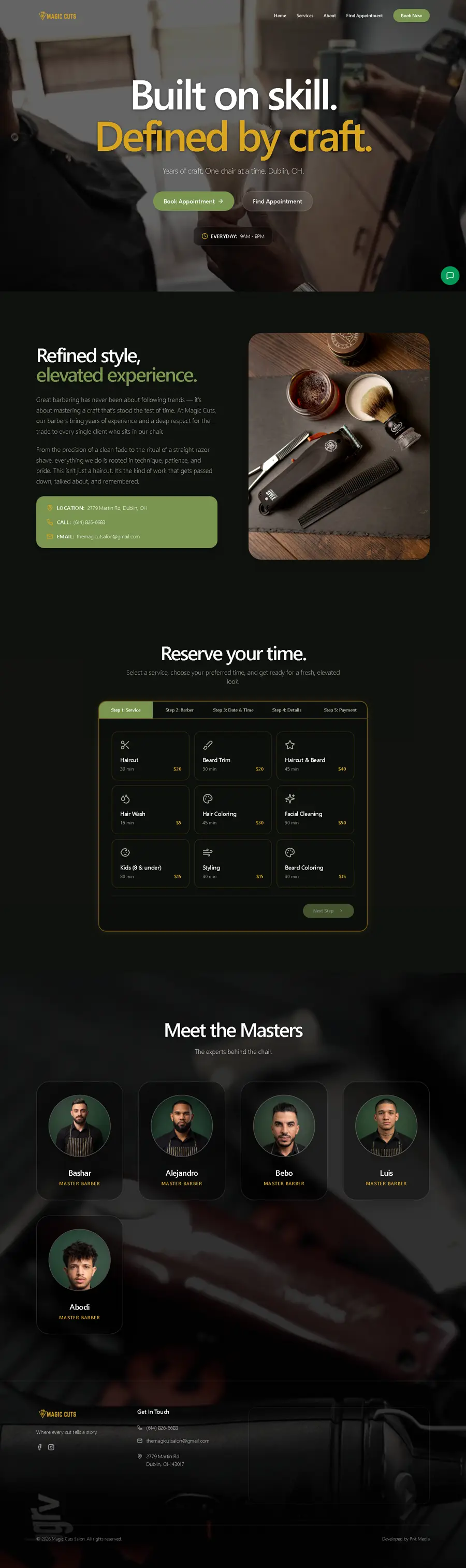
Magic Cuts
Barbershop, Dublin OH
Before
- A generic AI template, not built for this shop
- Customer bookings can be pulled up with nothing but a first and last name
- No review, rating or star anywhere on the page
- Three booking buttons in the first screen, going to two different places
After
- Built from scratch for this shop, not a theme with the name swapped
- Bookings sit behind real accounts, not a name lookup
- Twelve real Google reviews with the customers' own photos
- One booking action, five steps, no dead ends

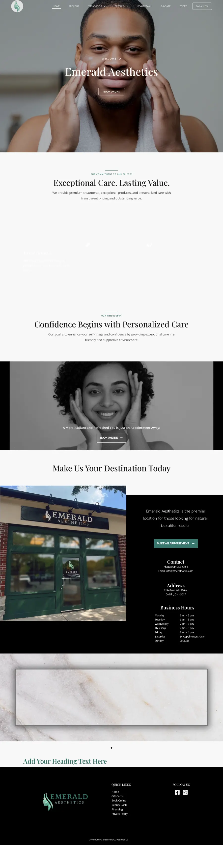
Emerald Aesthetics
Med spa, Dublin OH
Before
- Not one tappable phone number on a clinic's website
- No form of any kind. Every route off the page hands the visitor to Zenoti
- Four images on the entire page, none of them with alt text
- No h1 anywhere on the page. Nothing tells Google what the site is about
After
- Six tappable phone links, and the number in the header at every width
- A four-step booking flow: treatment, provider, date, details, with the real providers
- Thirteen providers with real headshots, and their own before and after pairs on a slider
- One h1, and a title that names the treatments and the city

Northern KY Roofing
Roofing, siding and gutters, Florence KY
Before
- On a phone the page overflows by 590px and 286 elements sit off-screen
- The only call to action is a phone number. No estimate form above the fold, no online booking
- A Wix template with hot pink over a roofing company
- No share image, so the link previews as a blank card
After
- Zero horizontal overflow on a phone, tested
- Free inspection booking in the hero, phone equally weighted next to it
- Built for the trade, not a template with the colours changed
- A share card that renders the brand when the link is pasted anywhere

